In my last post I illustrated how JMP can be used to plot mathematical functions. Visualising a function brings it to life, but what we see and how we interpret it can be very sensitive to the scale that we use. The following plots are of the same function but using different ranges for the x-axis:


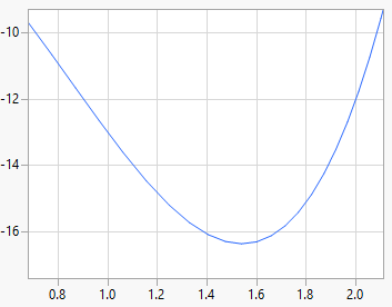
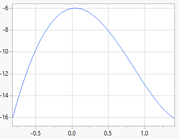
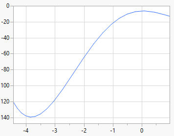
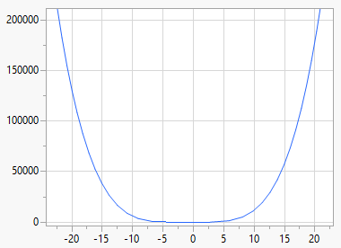
Your perception of “what the function looks like” is totally influenced by the choice of scale. Put another way, it’s really hard to describe the shape of the function without some additional context, in particular:
- the range and location of the x-variable
- understanding what represents an
important change in the response
If it’s tricky with a known function, just imagine how much harder it is when we’re trying to infer the function from data. It’s often said that “all models are wrong, some are useful” but equally we can say that “many models are right, some are useful”. All of the above graphs are correct, but some may be more useful than others. And if we need to perform and experiment to determine the shape of the function then we clearly have no hope unless we give thought to the sensitivity of our response variable and the range of our predictor.
I som tittar på dina webbplatser . Uppskatta det !