In this post I describe an approach that I use to teach statistics. The goal is to use JMP to help develop an intuitive understanding of some common concepts: hypothesis testing, p-values and reference distributions.
Introduction
Many statistical methods are expressed in the form of a hypothesis test: it’s one of the fundamental constructions within the field of inferential statistics. One of the outcomes of this construction is a probability outcome, or p-value, the notorious number which is subjected to extensive use and abuse! See for example:
Single Outcomes
When we conduct an experiment it can feel like we have collected an extensive set of data – but typically that data only represents a single sample. It’s hard to think in terms of probabilities once we have this data in our hands. Think about tossing a coin. Before a coin toss the probability of heads is of course 0.5, assuming a fair coin. But once the coin is tossed, I either have a heads or tails. There is no longer any ambiguity and the idea of probabilities feels irrelevant: the act of completing the experiment can make the use of statistics feel somewhat academic.
Multiple Outcomes
The way that probability is taught is to avoid the notion of single outcomes. We don’t just toss the coin once, we toss it 100 times – now the probability remains relevant after the event – the proportions of heads and tails are described by the probability.
The toss of a coin is of course a trivial example. But in all honesty I think that as soon as we move to more complex scenarios the probabilities get hard to understand at an intuitive level. We can do the math and understand the theory but there can be a disconnect between what is understood at an intellectual level versus an emotional gut feeling. At the end of the day if we conduct a complex experiment and collect the results, then we believe in those results: the p-value might be intended to help us keep in mind the probabilistic nature of the outcome, but as I’ve said before, it’s hard to think this way when we have single-outcome results in our hands.
You Cannot Be Serious
Part of the problem with the interpretation of p-values is that it can be hard to take the null hypothesis seriously: that means not understanding the nature of type I errors. A technique that I have found useful when running training courses is to make the probabilities more visible by using simulation techniques to give a better sense of the probabilistic nature of experiment outcomes.
Simulating the Null Hypothesis
First I have to decide what the null hypothesis is. Tossing a coin is too trivial. I like the idea of using a simple linear regression because it is very visual. It is easy to understand at a scientific level but sufficiently complex that it contains appropriate components of statistical inference (analysis of variance, parameter estimation, etc).
The graph below shows the case of a null hypothesis (red line) and an alternative hypothesis (blue line):
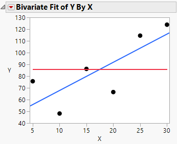
If we take a sample of data under the conditions of the null hypothesis then we cannot expect the data to fall precisely on the horizontal red line. Therefore there is ambiguity as to whether the data is indicative of the null hypothesis or the alternate hypothesis. It is this ambiguity that we try and describe using p-values.
In the spirit of JMP, interactive visualisation is a much more powerful way to illustrate the ambiguity. To do this we can sample data from a population described by the null hypothesis and then use this data to build a regression model; this process of sampling and modelling can be repeated over and over, in just the same way that we can toss a coin multiple times.
The single-sample simulation can be articulated using a JMP table with a column formula:

Based on the data in the table, the Bivariate platform can be used to visualise the relationship in the data. Using a script the random components of the formula can be updated and the graph can be refreshed. Each refresh corresponds to a flip of the coin.
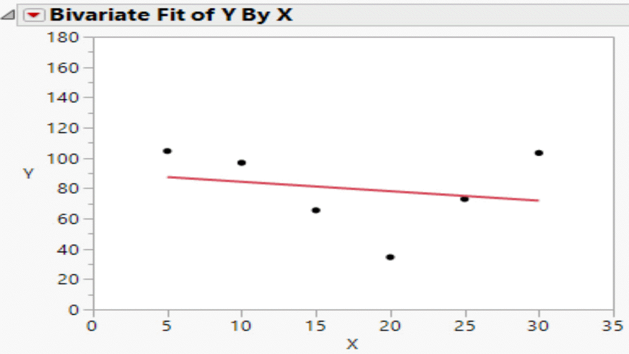
This is what the the null hypothesis really looks like!
Developing Insight
The above visualisation really helps to express the problem that we are trying to solve when we use inferential techniques embedded within our model building process. And we can go further than just visualising these outcomes – we can analyse the data and get insights that provide intuition into traditional statistical theory.
R-Square
One statistic that scientists feel very comfortable with is the R-square statistic. We would expect an R-square value of zero if the null hypothesis were true – but let’s take a look at how it really behaves based on our simulated outcomes. Here is a grid of just 9 runs:
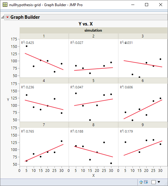
Most people would probably think that an R-square of 0.76 would be associated with a “significant” model. If you teach statistics, how many times have you been asked “what is a good value for R-square?” – well now we can start introducing probabilistic thinking even to this question!
For the entire collection of simulation runs we can look at the overall distribution of R-square values:
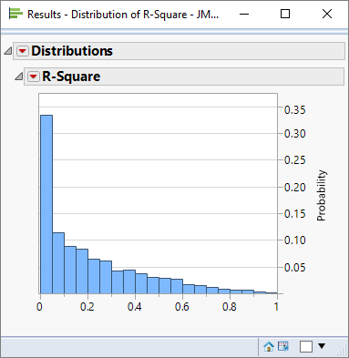
It is interesting to ask where the 95% threshold is. That is, we would like to be able to make a statement along this lines of “95% of the time the R-square has a value less than xyz”. This can be achieved using the JMP data filter – slowly moving the slider from the right hand side until 95% of the rows have been selected:
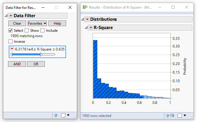
For this scenario we can say that 95% of the time the null hypothesis generates an R-square less than 0.635. Or: there is a 5% chance that the R-square statistic will exceed 0.635 even if the null hypothesis is true.
F-Ratio
If you have followed the logic that I described for the R-square statistic then you will realise that exactly the same procedure can be applied for statistics more appropriate to statistical inference.
Specifically, the simulation script can grab the F-ratio values displayed in the ANOVA table, and these values can be plotted as a histogram:
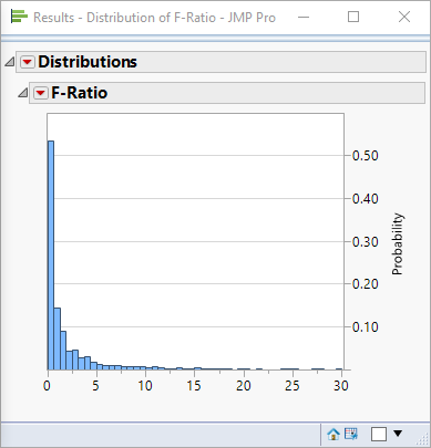
What have we just done? We’ve discovered the F-distribution empirically!
And using the data filter we can determine the 95% threshold:
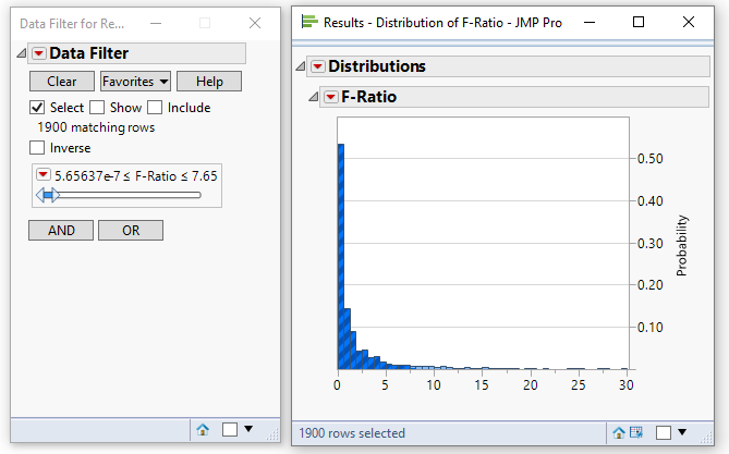
For this sample the threshold value is 7.65. What have we done? We have just determined empirically the p-value for an alpha level of 0.05 (theoretically, for this number of degrees of freedom, an F-ratio of about 7.7 generates a p-value of 0.05).
t Ratio
A similar procedure can be applied to a t-ratio. However, when comparing the absolute value of the t-ratio the data filtering needs to be performed in two steps. First select a high value that eliminates 2.5% of the data:
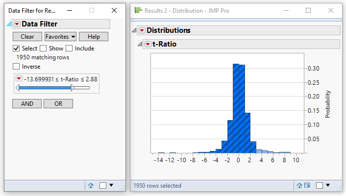
Then adjust the lower value so that the total number of matching rows is 95% of the entire data:
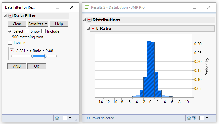
Based on this example we would conclude that an absolute value for the t-ratio of 2.88 yields a p-value of 0.05. This is in excellent agreement with the theoretical value for this number of data points.
In Summary
Not only is JMP an excellent tool for statistical analysis and visual discovery, but it can also be used to provide a level of intuitive understanding of statistics beyond that which is achieved through traditional teaching. The techniques that I have described in this post rely on some relatively simply JSL scripts to (1) repetitively generate regression models based on randomly sampled data and (2) extract summary statistics from the Bivariate report window. I’ve not listed the actual code for these scripts because this is a post about statistical learning, not about programming – however, feel free to contact me if you would like details of the scripts.